


CRISTAL LA STORIA
О ПРОЕКТЕ
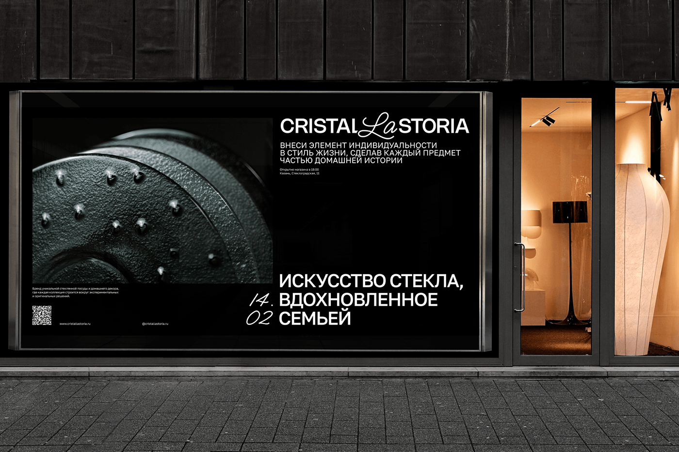
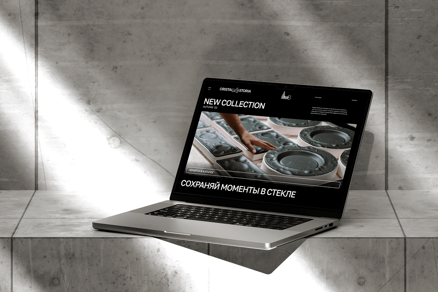
Cristal la storia [итал. кристальная история] — бренд уникальной стеклянной посуды и домашнего декора, где каждый предмет создаётся путём экспериментальных и оригинальных решений.
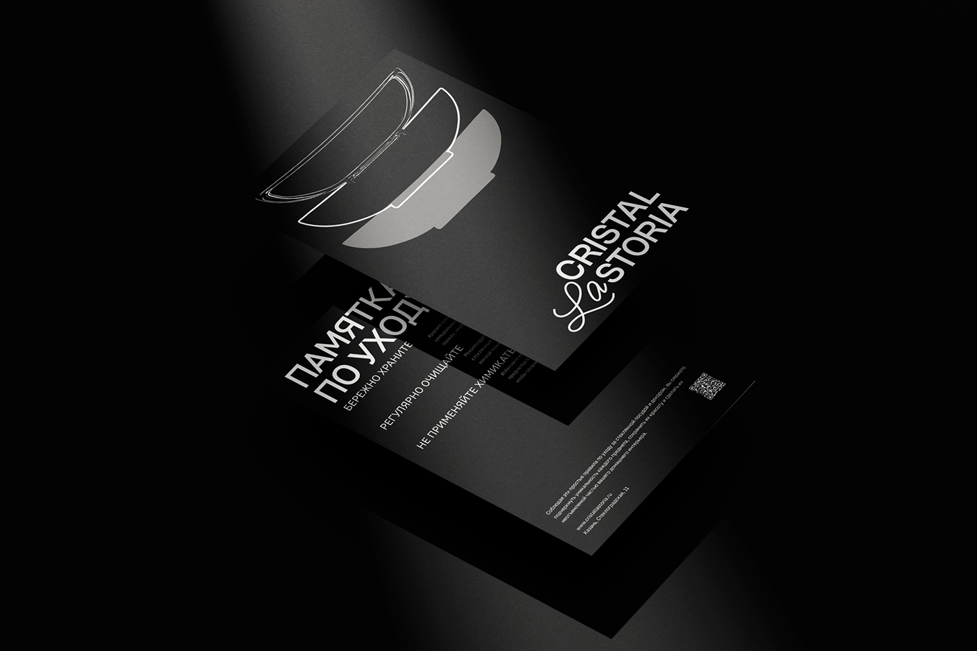
Логотип отражает это сочетание с помощью использования двух шрифтов. Гротеск указывает на две важные составляющие компании: кристалл (стекло) и история. Рукописный артикль на итальянском языке придаёт логотипу элемент роскоши и изыска. Тем бренд и уникален, что каждая тарелка или подсвечник создаётся в единственном и неповторимом экземпляре.
Название бренда использует итальянский язык, чтобы отразить одну из главных национальных традиций страны — уважение и почитание семьи. Слово cristal используется в названии бренда из-за ассоциаций с высококачественным, прозрачным и чистым стеклом. Это создает престижный имидж бренда и привлекает внимание покупателей, которые ищут стильную и уникальную стеклянную посуду.
Такой выбор названия обусловлен миссией бренда — укрепление семейных ценностей, а цель компании — сделать каждый предмет частью домашней истории, добавив элемент индивидуальности в повседневную жизнь.
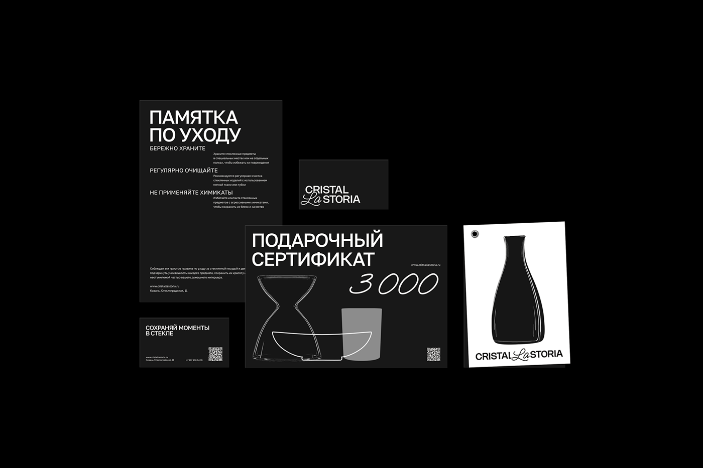
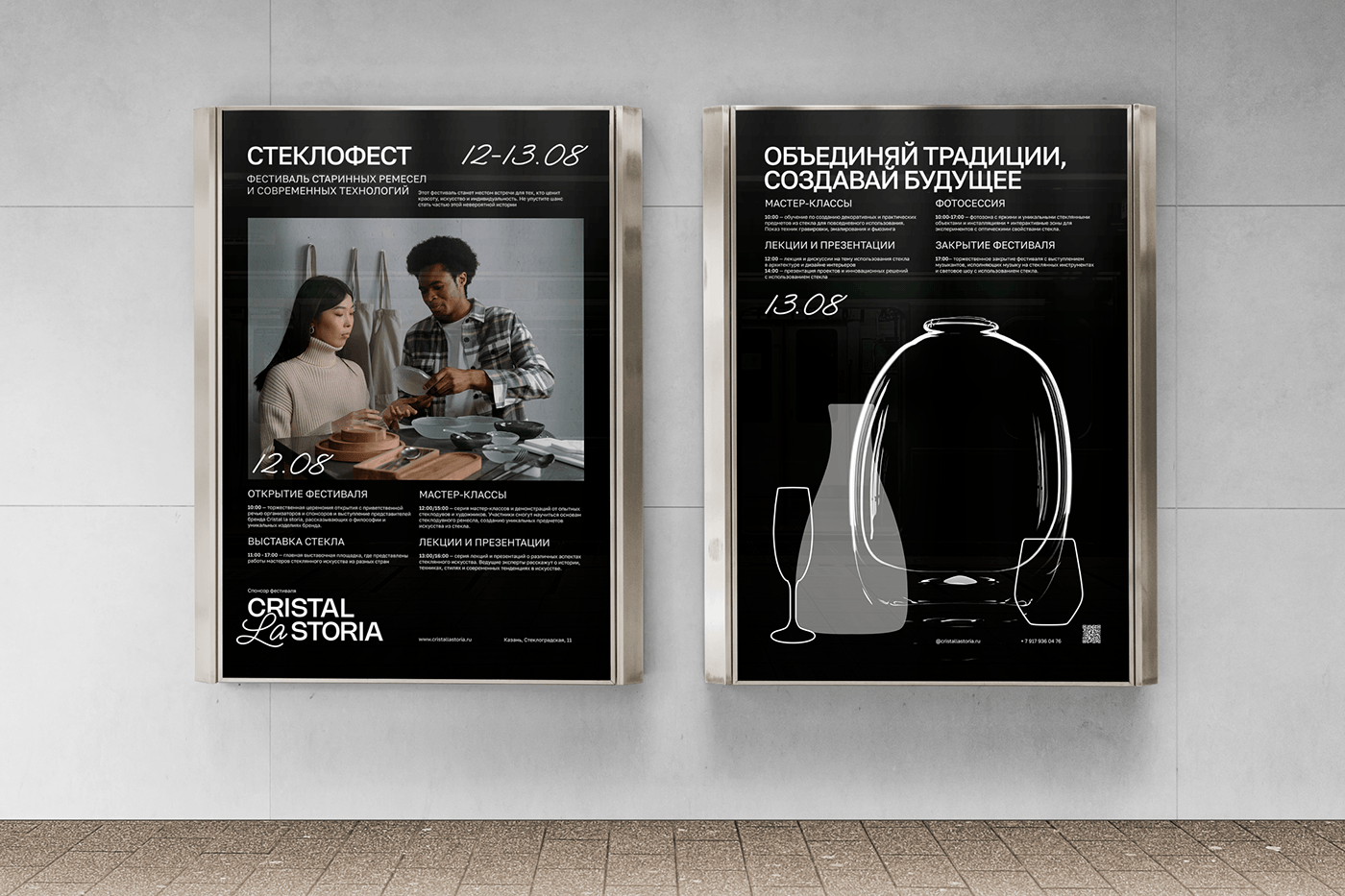
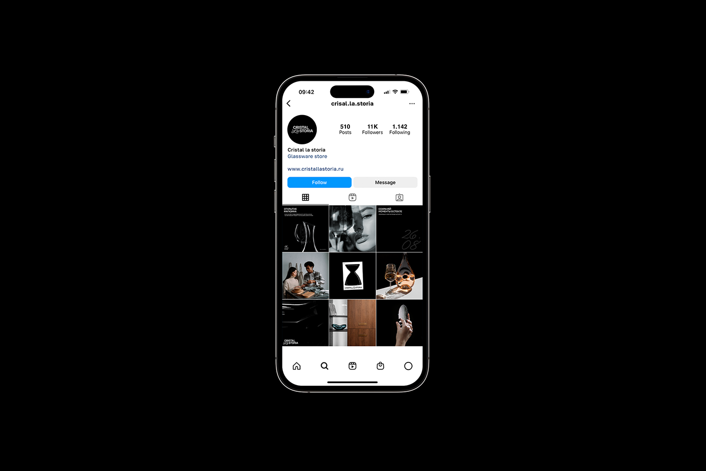
История каждой семьи состоит из событий, которые традиционно сопровождаются праздничным ужином. Поэтому в основе айдентики лежат силуэты посуды, собрав которые, становится возможным увидеть уникальные семейные истории. Проект включает в себя три вариации представления визуальных образов посуды. Фотографии предметов сохраняют их реалистичные детали и стиль, а силуэты создают тени, символизирующие невидимые, но важные аспекты каждой семьи. Обводка, как нить, объединяет моменты, события и традиции. Клиенты могут собирать свою историю по мере приобретения различных предметов в магазине Cristal la storia.
ABOUT THE PROJECT
Cristal la storia [Italian: crystal history] is a brand of unique glassware and home decor, where each piece is created through experimental and original solutions.
The logo reflects this combination through the use of two fonts. The grotesque indicates two important components of the company: crystal (glass) and history. The handwritten article in Italian gives the logo an element of luxury and sophistication. What makes the brand unique is that each plate or candlestick is created as a one-of-a-kind piece.
The name of the brand uses the Italian language to reflect one of the main national traditions of the country - respect and honor of the family. The word cristal is used in the brand name because of its associations with high quality, transparent and pure glass. This creates a prestigious brand image and attracts the attention of customers looking for stylish and unique glassware.
This choice of name is due to the brand's mission of strengthening family values, and the company's goal is to make each item a part of the home history, adding an element of individuality to everyday life.
The history of every family consists of events that are traditionally accompanied by a festive dinner. Therefore, the identity is based on the silhouettes of tableware, by assembling which it becomes possible to see unique family stories. The project includes three variations of presenting visual images of tableware. Photographs of the objects retain their realistic details and style, while the silhouettes create shadows that symbolize invisible but important aspects of each family. The outline, like a thread, unites moments, events and traditions. Customers can collect their history as they purchase various items from the Cristal la storia store.
Designer: Regina Samigullina
Logo Mentors: Darya Basalaeva & Lera Mazlova
Art Director: Tatyana Kirichenko


